3 Simple Signage Mistakes Portable Churches Make
Posted by Adam on 16th Jul 2019
If you're part of a portable or pop-up church, we know you have some unique challenges. (If you're not, forward this email to someone you know that this could help!)
We see 3 mistakes that portable churches make, and the good news is, there are simple to resolve!
1) Missing signage at the road that says "You've found us" or "Welcome to Our Church" or "Come on in!" Give people looking for your church a clear indicator that they've found you, so they know where to come.
2) Unclear entrance signage that says "Use This Door" or "Welcome" or "Enter." This way, you can focus attention to a single door that works best for your team to create an incredible first impression, and your guests clearly know which entrance to use.
3) No way-finding signage that says "Auditorium this way, kids classes that way, etc." Your goal is to create a comfortable environment so people can experience Jesus. We all feel much more comfortable when we know our way around, or aren't getting lost in a building we've never been before, so some simple signage can help raise the comfort level.
Here are some solutions to help with each of these 3 steps:
Step 1: Signage at the road that says "You've found us" or "Welcome to Our Church" or "Come on in!"
 Flag banners are perfect for grabbing attention since they move easily in even the slightest breeze, and our eyes are naturally drawn to movement.
Because they are usually moving or flapping, keep your message simple. 3 or 4 words at the most, but the fewer, the better. Sometimes a simple "welcome" banner customized with your logo is all that is needed to get the message across!
Flags can be printed in bright colors that match your church's logo and color style and in many different shapes and lengths.
They are available in single sided and double sided (read more about those options here!).
Ask our design team about the option of having a spike bottom (perfect for soft surfaces, like grass, dirt or in a flower bed) or a base, perfect for hard flat surfaces like the sidewalk or driveway
Check out our feather flag designs.
Step 2: Entrance signage that says "Use This Door" or "Welcome" or "Enter."
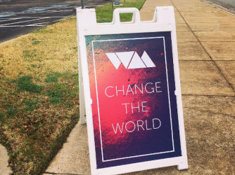
Sandwich boards are great solution for something as simple "Welcome" with an arrow and your logo. They're easy to move around when needed, can be stored flat, and are not tall and overwhelming like a larger banner style might be.
Check out our sandwich board styles.
Step 3. Way-finding Signage that says "Auditorium and restrooms this way, kids classes that way."
 At this point, your guest has walked into your building. Your First Impressions team will have the responsibility of being their guide through your building, but there's always the possibility that someone shows up late, or while the other team members are all busy.
This is where your signage helps them find their way to their classes or to your auditorium.
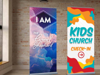
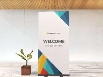
Roll up banners are the most versatile for indoor use. They can offer the brightest colors, and roll down to store in a simple carrying case.
Check out our roll up banner designs


