Directional Signage: How Much Is Too Much?
30th Jul 2024
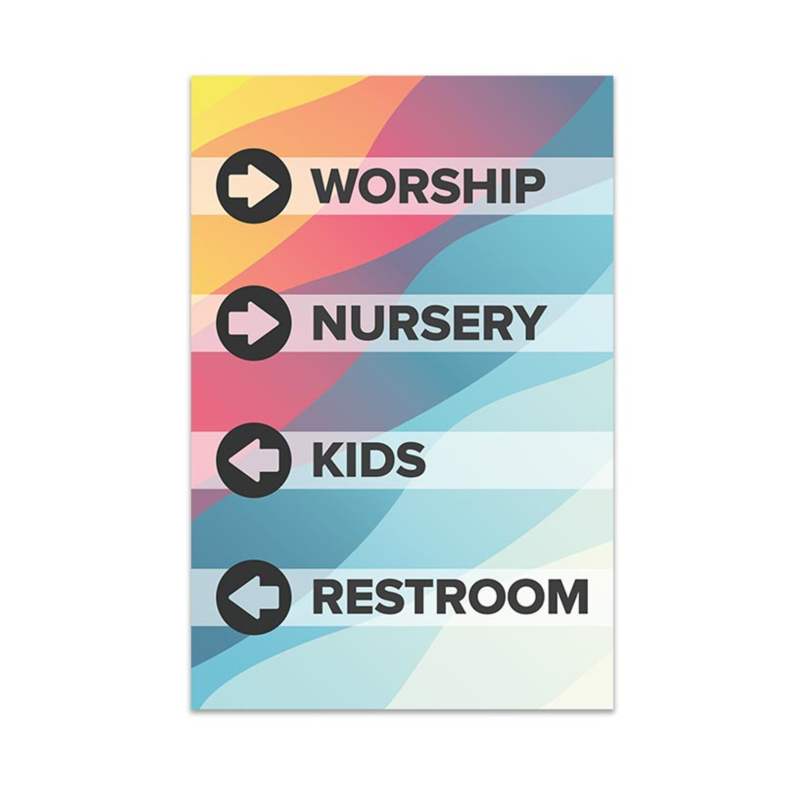
Our church clients ask us all the time: How much directional signage do I need at my church. It's a good question and will vary from church to church. While we can create directional signage to match your church's style and color scheme, it's often considered an eye-sore rather than an art piece, but it doesn't have to be.
On the other hand, you don't actually want it to be merely an art piece where it's admired for aesthetics and blends in with the decor, but doesn't serve a functional purpose for your guests.
Who is Directional Signage for?
Let's start here. If someone has been to your church 2 or 3 times before, they probably don't even consider the directional signage. Returning guests and church members already know where the restrooms are, they can find their way to your auditorium, and if they have kids, they've learned where to check them in and how to get to the parking lot after service.
Some churches imagine that directional signage is completely unnecessary as long as they have a welcome team who is always ready to help someone find their way.
Directional signage (sometimes called wayfinding signage because it helps you find your way) is never a replacement for a pro-active guest services team, it does serve the purpose if your guest services team is with other guests, or if you have a guest who would rather find their own way than start a conversation with someone they don't know.
To answer the question; Directional signage is for people who are not yet completely familiar with your building: your church guests.
What needs to be included in your church's directional signage?
You probably realize that you don't need the directional signage to include your janitorial closet or the church kitchen, since guests don't need that information, but you might be wondering if you should include an arrow for "Kids Classrooms" or if you should have multiple arrows for Infants, toddlers, preschoolers, etc.
We recommend that your directional signage should show the one next step to whoever needs it, so walking in your front door, directional signage needs to show an arrow to your kids classrooms or check in (not each classroom, unless some are to the left and others to the right).
Once a family is checked in, then they can get to the kids hallway where directional signage can show them where to go for each classroom. Again, it's great if you have a volunteer who can walk them to the classroom itself so they don't have to rely on signage, but in the case where your volunteer is already with one family, the next family can still find their way.
Consider next steps
Walk through your building as if you're a new guest.
Remember that you may need some outdoor wayfinding signage if you have multiple buildings on your campus, or multiple doors to your building. You might have guest service team members at every door, or your might want signage in the parking lot to point visitors to a specific door.
As you walk through the front door - what are you needing directions to. We would recommend:
- Kids check-in
- Restrooms
- Auditorium
Of course, each church is unique so you may have additional things on your signage (like a multi-purpose room, a coffee shop, youth room, gymnasium, chapel etc), but these three are the things that most visitors will need as a minimum.
Now, imagine you're a family. You follow the arrows to the kids check-in. Now you need to be able to see a sign that gives you directions to the appropriate classrooms. A family might have kids in multiple age groups, so as I leave the classroom, is it clear where the next age groups are?
Now that a guest has dropped of the kids, they probably need to find their way to either the restrooms or the auditorium / worship center / sanctuary.
When they leave the auditorium after service, directional signage will need to point to the restrooms, kids areas to pick up their kids, and the parking lot - yes, finding the parking lot may seem obvious if you've been in the building multiple times, but don't leave your guests with a poor lasting impression of wandering your facility looking for the way out.
If you have an information center or guest services desk that is not directly in front of the door, then that's a probable destination if a guest is going to pick up their welcome gift or register for an event they hear during announcements.
Now that a family goes to pick up their kids (is this a different location from where they dropped their kids off?) they leave the kids classroom, and need directions to both the restrooms (parents know...) and the parking lot.
If they have to make a turn to get to those, there needs to be signage there to give them directions at that junction in your hallway.
It's not unusual, even for a small church, to need 10-12 directional signs throughout their facility, and larger facilities with multiple levels, or multiple buildings around their campus, often require more.
Where should directional signage be mounted?
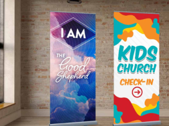
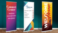
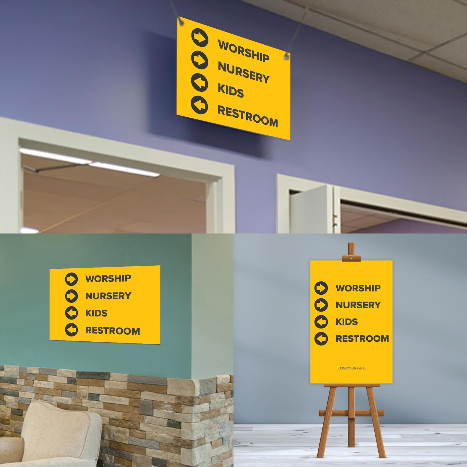
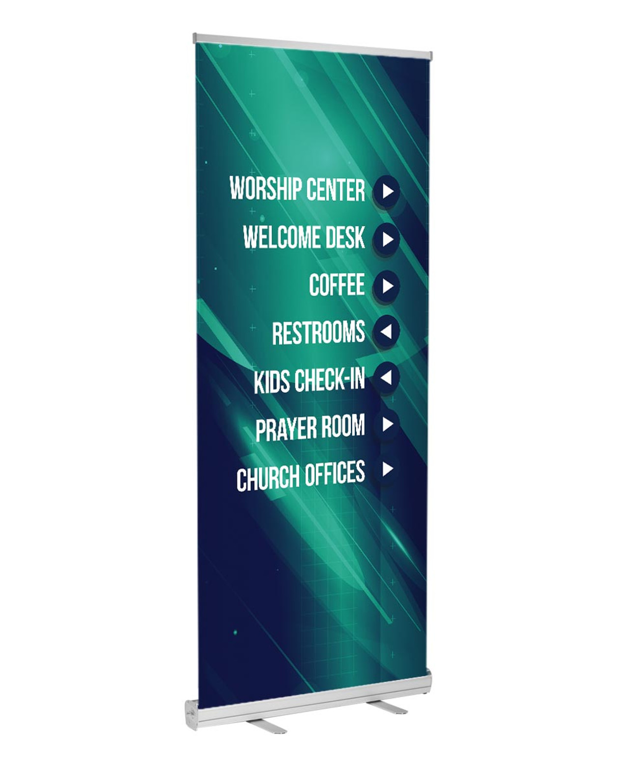
Wayfinding signage can be mounted directly to walls, hung from ceiling tiles, or in the case of portable or pop-up churches, it can be on a roll up banner in an open area, or mounted on an easel or stand.
Keep in mind that there may be a crowd of people in some areas of your building (lined up for kids check-in or for the coffee shop) so directional signage needs to be high enough that it's able to be read over the heads of a crowd of people.
In a portable church setting, you may need to have roll-up wayfinding signage which may not entirely sit about the heads of the crowd.
In this case, try and put your signage at a crossroads in a hallway (fewer people will stand where traffic intersects in a hallway) or if you have high enough ceilings, consider placing your signage on top of a table or bench to give it some additional elevation.
How should directional signage be designed?
Choose a high-contrast between your background and your text color. You may consider a design from our directional signage catalog that includes a shadow behind the text or an outline to be sure that words are legible in contrast with your background.
If you're in an area with large windows and bright sunlight, contrast is even more important as reflections from your sign or simply the brightness of the area can reduce the natural contrast of a design.
If you have plenty of sunlight, you might consider a low-gloss material that is less likely to reflect the sun when someone is trying to read the sign.
It's also important to consider the style of your church, and choose a design that both matches the style of your space and the colors of your space. You don't want your church directional signage to look out of place or mismatched simply to be functional. If you can't figure out exactly what would look best in your space, a black and white style will go with almost anything, and they're a great contrast.


