Ideas For Indoor Church Banners for 2023
13th Dec 2022
You may have heard of a marketing term called a funnel.
At the top of the funnel (the widest part) are all of the potential visitors to your church: people driving by who live in your community, the people who see banner designs you're using to attract passing traffic, and those in your city who see your outdoor banners advertising an event or flags in your parking lot. This is the widest selection of people.
When people decide to visit your church, the funnel starts to narrow - there are fewer people in this group, but they're also one step closer to becoming active members of your church community. They've probably visited your church website to find your service times, heard about your upcoming events, seen your outdoor banners and have made the decision to visit your church on a Sunday.
At the bottom of the funnel are the people who have decided to become church members.
Many churches focus primarily on the top of the funnel. They ask how many people can we sow a seed of the message of Jesus Christ even if they never visit us at our church.
Another group of churches focus primarily on the bottom of the funnel - providing services, events, prayer, and ministries for their members who will then take the message and faith of the gospel to the community.
Both styles are important and work together to reach a community - church partners, not church competition, but whichever style you lean towards, don't miss out on the 'middle of the funnel' people: new visitors who have chosen to visit your church but are not yet church members.
Understanding The Importance of Indoor Church Banners
The experience you create inside your building can help take people from "church visitors" to "church members." It's often the deciding factor.
Indoor banners need to balance the message your church wants to present to visitors and the style you want to present to visitors - or how you would like your church community to feel to a guest.
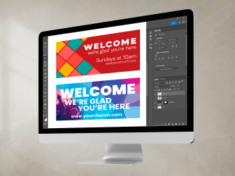
As an example, indoor banners won't need to include details like service times since the guest is already in your building for service. New visitors have already found the service times on your church website or your outdoor banners, and now they're here to find out what your church is really like.
You'll want to have a clear idea of your design style to keep all of your indoor banners looking consistent in style and design, especially if you have a small space.
A few well-designed banners as decor items will be much more effective at setting the atmosphere compared to many different designs brimming with important information.
Consider the moment a church guests steps in the front door of your church campus
Many churches want to promote featured events to let church goers know what's coming up and provide opportunities to invite friends. This might make the church signage hanging in your entrance area an ideal way to let guests know what's coming up.
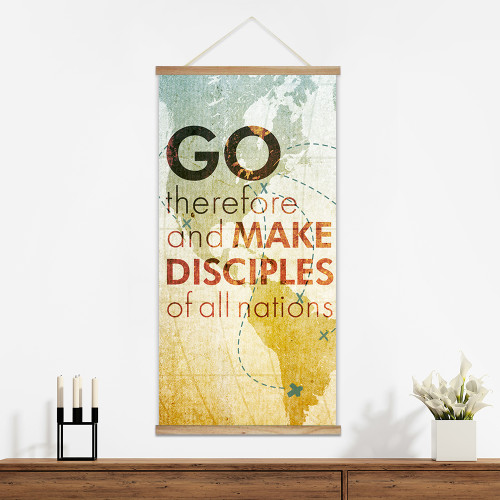
Other churches will choose to highlight their values: faith, grace, hope, outreach, family life, or prayer.
Still other churches will choose banner designs to highlight their mission efforts with pictures of children their serving overseas, a map of the wells their drilling or churches or ministries they're planting, or upcoming outreach opportunities in the community.
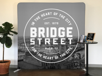
Whichever direction you choose to go, your indoor church banners say much more about who you are than your outdoor church banners say about what you do.
This moment someone steps in your church starts to create a first impression about what your new visitors are going to experience and what they should expect if they choose to join your church community. Your choice of indoor banners contributes to that first impression.
Once you've decided on the messaging, choose an indoor banner style that best reflects your church
There are three categories your indoor church signage will fall into:
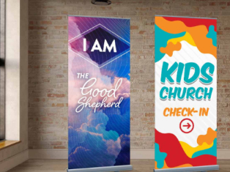
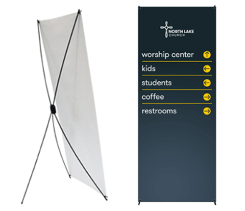
- Wayfinding - helping people find their way around
- Decorative signage - a way to decorate your space and act as a reminder of your values
- Event-based signage - promoting a current or future event
From our experience working with thousands of churches and ministries and printing our share of church banners, we find that churches are most happy with their indoor banner design selections when they print wayfinding signage and decorative signage to me in matching or complimentary styles and then choose an attention-grabbing style for temporary event signage.
Whether you're drawing your design inspiration from another building in town, another church you've visited, or a vision you're making come to life, having a consistent style from wayfinding and decorative signage creates cohesiveness and is an effective way to give an idea of style.
Making your temporary event signage stand out from your usual style is an effective way to draw attention from time to time, letting new visitors know that you have events going on in your community or opportunities for their family to serve without drawing attention away from the general style of your church through your banner designs.
Creating a cohesive indoor church banner design style
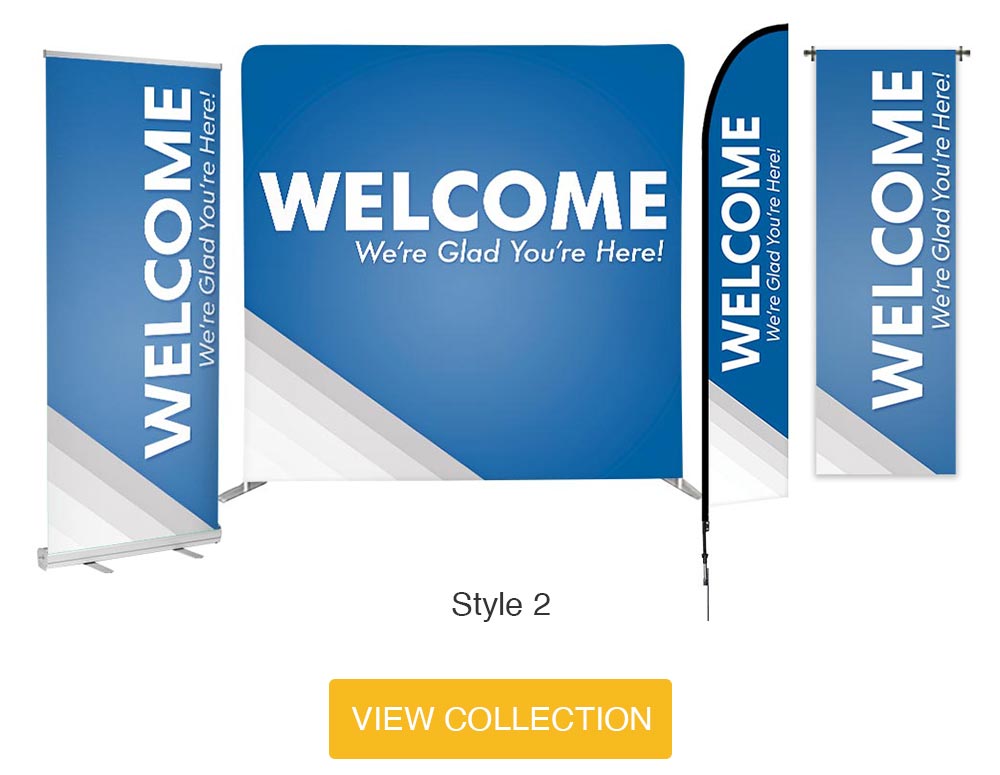
Imagine you've chosen a welcoming blue with grey accent style for your wayfinding signage and a primarily grey with blue accent style for your decorative signage to emphasize your church's mission. You've printed some wall art banners and have a few wayfinding signs that stand at important hallways through your church to help new visitors find their way.
You print an upcoming event banner in a black and white design with orange accents to bring attention to your community outreach for four weeks.
Your design style is a cohesive blue and grey, but the orange accents are going to grab attention for the four weeks you're highlighting your outreach in the park. An ideal way to draw attention is to stand out in a unique way for a short amount of time.
Alternatively...
If a church chooses to have a wide selection of fruit of the spirit banners, indoor flags, directional signage banners, and designs to provide inspiration, all with individual color schemes and then tries to draw attention to a specific event, that event banner design is going to get lost in the visual clutter already in the space.
New visitors are likely to get confused with all of the information. on those indoor banners rather than be drawn to the information that's relevant to them. They may miss learning about the event connecting their family to the church because of the visual cutter.
Using An Image Instead of Just A Design On Your Indoor Church Banner
We know the old saying that a picture is worth a thousand words. Instead of just a banner that says 'Love,' send our design team a candid picture of people in your church giving a hug or a high five. Instead of a banner that simply says 'outreach,' send our design team a picture of someone in your church serving in the park.
We're happy to customize any design in our catalog at no extra charge, so start by choosing a design that you like and chat with our team about the indoor banner designs that will create exactly the first impressions you're hoping for at your church.
View our catalog and get started customizing your indoor church banners today!


