Signage: Obvious is never too obvious
Posted by Adam on 26th Jun 2018
There's a level of obviousness that is comforting to a new guest at your church. When you have obvious signage that's clearly only intended for guests, then you give a clear indication that you've been expecting guests.
If a family is visiting your church for the second time, then they remember where the auditorium is or where to check in their kids, or where the restrooms are, so the signs aren't really for them, but having signs that indicate these "obvious" things also sends a message that you're anticipating having first-time guests.
It's an unwelcoming assumption that people know where your auditorium us, or that if they don't see kids classrooms when they walk in, then they must be downstairs.
A great example that obvious is never too obvious is this entrance to your favorite Swedish furniture store.

Besides multiple directional arrows in the parking lot, and a directional sign at the exit door (in case you accidentally end up there), a third of their building painted yellow. You can't accidentally go in the office entrance assuming it's the front door.
So why is obvious is never too obvious?
Aren't we going to offend a visitor's intelligence if they need a sign to say where the restrooms are? Actually, quite the opposite.
When someone is in an unfamiliar place, there is a comfort that comes from finding your way around on your own. Once you're in the entrance, what's the next obvious step? It's the map at the entrance to the theme park or the sign that tells you where to drive when you are approaching a mall.
At your church, the obvious first steps are the auditorium, restrooms, and kids check-in area.
Walk through the front door of your church pretending you've never been in your building before (Better yet, invite a neighbor or family member from out of town and ask them to try this simple test). By the time you take one step in the door, do you know where the auditorium, restrooms and kids area are?
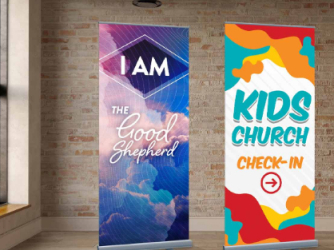
 If the answer is not yet, one of the easiest ways to function without modifying your campus is with roll-up banners.
These flexible banners are great for indoor or outdoor and they can stand up above a crowd for visibility. The durable material allows them to retract so they're out of the way during the week if you don't offer kids classes during mid-week service, or want to replace them with something different for youth night.
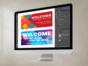
For portable churches meeting in schools or community halls, these retractable banners can be customized to match your church's branding so as a guest walks through the front door, they are consistently seeing your color scheme and logo, even while you're growing in a portable space. If a classroom location or meeting space changes, roll-up banners are an economical choice to replace when needed without breaking the budget.
The best news is, ChurchBanners.com can often ship in less than a week, so you can be "obvious" this weekend. Check out our roll up banner options.


