Visual Consistency: When to insist and when to resist
Posted by Adam on 16th Oct 2018
 Visual consistency is a powerful tool because our brains are wired to recognize patterns. We recognize the McDonalds' "M" while driving down the highway, the Apple logo on the back of a MacBook from across the coffee shop, and the look of your favorite beverage label in a sea of beverage choices at the gas station.
In all of these cases, these major corporations have tapped into visual consistency. It's so important that there are rumors of entire shipments being sent back to the manufacturers because of a color or design inconsistency. (That's a blog post for another day).
BUT visual consistency can go overboard where everything looks so monotonous that it starts to blend in. There are times when a visual element is best to stand out from consistency - to stick out like a sore thumb for attention.
When you walk into a clothing store, and everything is in "this season's colors" there is often a few pieces that are a complete contrast to everything else going on in the store. This is to break the sea of blue for instance. So how and when can we insist or resist visual consistency at our church?
When do you insist on or resist visual consistency at your church?
Insist on visual consistency when it comes to your church's logo.
If you logo is a circle, then it's always a circle. Get hyper-vigilant that it's not going to be squashed or stretched as an oval. If it's a square, it's always a square. If it's in Myriad Pro font, then there are no alternatives.
As an example, which of these is the proper ChurchBanners.com logo?

Yep, the center option. We're insistent on this: on our website, facebook and instagram, emails, invoices and print material.
This could seem like going overboard or policing something that, to the average person, doesn't really matter all that much, but there is so much information coming at us in our visual world, that we really need to be intentional with the limited attention we have from people who visit us or connect with us on Social Media at our church.
In the same way that there are hundreds of restaurants you could choose to eat at, McDonald's 'M' is always out front, always the same size and always recognizable by a hungry 4-year-old.
Insist on visual consistency when it comes to your color palette.
Have your main color, 1-2 complimentary colors in your color palette along with a specific shade of grey or black. If you logo is blue, your complimentary may be grey, black and white only. You may choose to add in a specific contrasting accent color like orange, or a complimentary version of yellow or tan.
(here's a great FREE tool to help build a color scheme)
Resist visual consistency when you need something to stand out.
This could be a seasonal event like Easter or Christmas. Be sure your logo is still proportionate and in your pre-determined colors, but have fun with the design to match your theme or season. (this is a great time to use a white or grey version of your logo to avoid stark contrasts).
Standing out could also mean a special giving opportunity, a change in classroom locations or adding a new service time. In this case, "Standing out" could look be an inverse of your color palette.
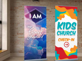
Here's an example of using the ChurchBanners color but inverting our visual consistency to make something stand out:
 |  |  |  |
This works well for print material, website pages and for creating a contrast in signage within your building (maybe the kids classes and directions are in your complimentary colors while your auditorium, restrooms and guest services directions are in your primary logo color).
Resonate clearly with the people who visit your building and interact with your online through your visual consistency. Our design team is available to customize any design in our catalog to match your branding and visuals. Get started today!


